Picking Bitcoin tops is notoriously difficult, and we will never really know until after the fact. However we can look for confluence across several metrics that can improve our odds.
One of the most requested topics I receive, and at no surprise, is to cover how I think about finding Bitcoin cycle tops. You will often hear me saying that I don’t anchor to a specific price, nor date target, as these are ultimately completely arbitrary guesses.
Instead, I want to watch out for the market mechanics that precipitate a bear, and then I will make the assessment that a top might be in. There are a few important ideas I keep in mind when tackling this problem:
- Bear markets start when too many people, buy too many coins, at too high of a price.
- HODLers are the ones that establish tops, after they distribute a sufficient volume of coins to oversaturate demand.
- Demand is the ultimate unknowable variable in a bull market, as we never know who will, or won’t end up allocating to the asset.
- The day after the best day of the bull market, is often the first day of the bear.
So with all that said, let’s run some numbers and see if we can establish whether a Bitcoin cycle top is likely to be in place today.
Cycle Top Hunting
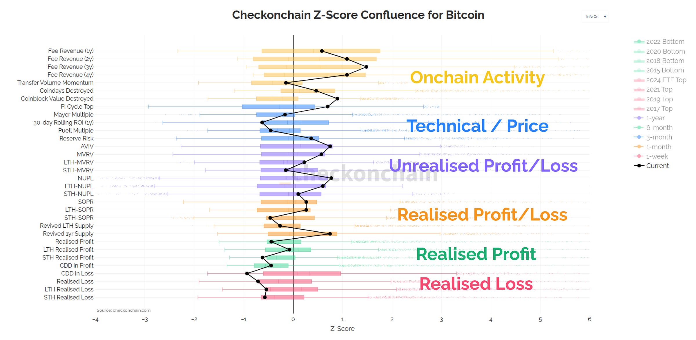
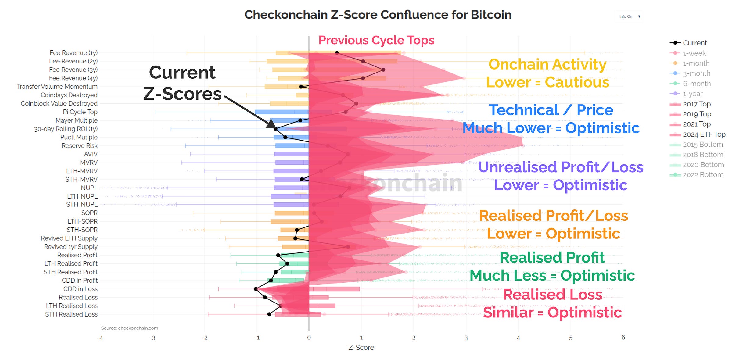
The tool below is a new one, and is designed to assess confluence across many sectors of the Bitcoin market. It helps me compare the current market conditions to those I would expect to see around cycle tops and bottoms, in the shortest possible time. As we run through the tool in this post and video, I will provide my assessment for whether I’m Concerned, Cautious, or Optimistic about what I see.
Importantly, this is an unlisted chart, and it will only be available for folks reading/watching this report.
The chart is constructed as follows:
- I have computed a Z-Score for a wide variety of metrics, each of which describe a particular sector or category of the Bitcoin economy. These Z-Scores are tailored for the characteristics of how each metric behaves.
- The Box and Whisker plots show the distribution (population) of those Z-scores.
- The thick candles represent the middle 50% of observations, and the whisker tails are the upper and lower 25% of values.
- The thick black line shows the current Z-Score value for each metric so we can assess where we currently are.
In sports terminology, this tool helps us visualise how deep into the four innings we are.
The further we deviate from the centre line, the more extreme the market conditions are (and thus the less likely they are to persist).
 Live Chart
Onchain Activity
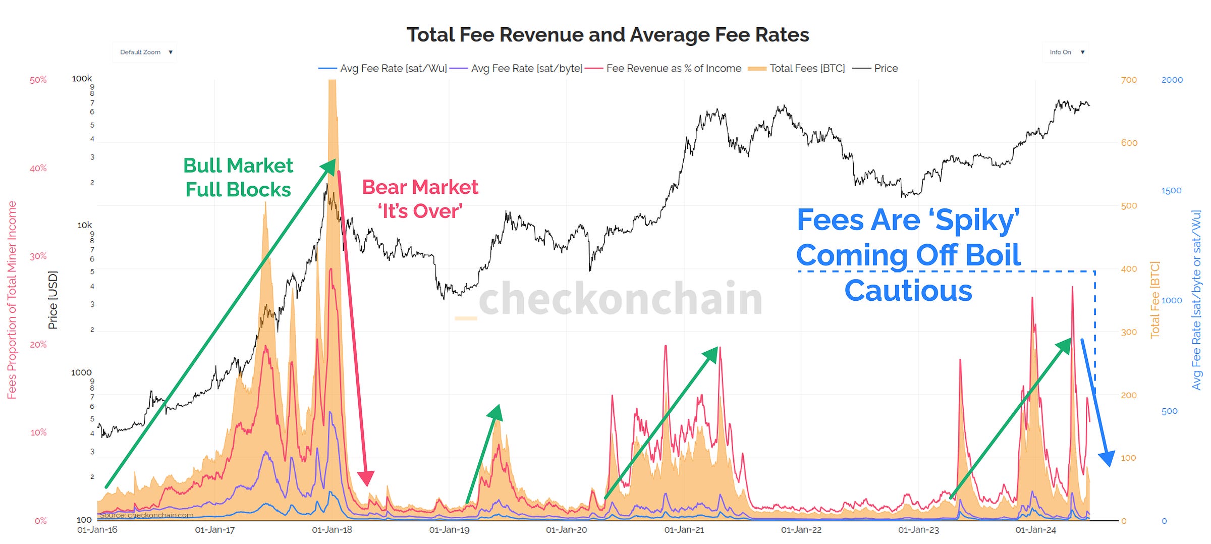
The first sector is onchain activity, describing how alive and active the Bitcoin network is. If nobody is using Bitcoin, it probably isn’t a great sign. Conversely, if blocks are full, and volumes are high, we’re gravy.
As it stands, fee pressure is elevated, however much of this is due to non-standard transactions like inscriptions and runes. Fees have also been spiky, and inconsistent, which gives me a moment of Caution.
That said, if my longer-term read is correct that we are in the early innings of a macro bull cycle, we may still be in the 2016 and 2019-esque phase of fee pressure, which is expected to be lighter.
 Live Chart
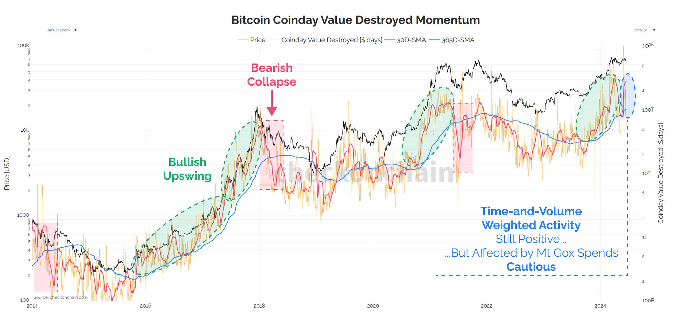
Aside from fees, the time-weighted transfer value is my other go-to metric for assessing how alive the chain is. Here, I use a simple 30-day vs 365-day moving average cross-over to determine momentum.
Right now, we have positive momentum, however it doesn’t have the level of ‘oomph’ and strength I would hope to see. This has me Cautious that onchain activity is a little weaker/softer than I’d hope for.
 Live Chart
Pricing Models
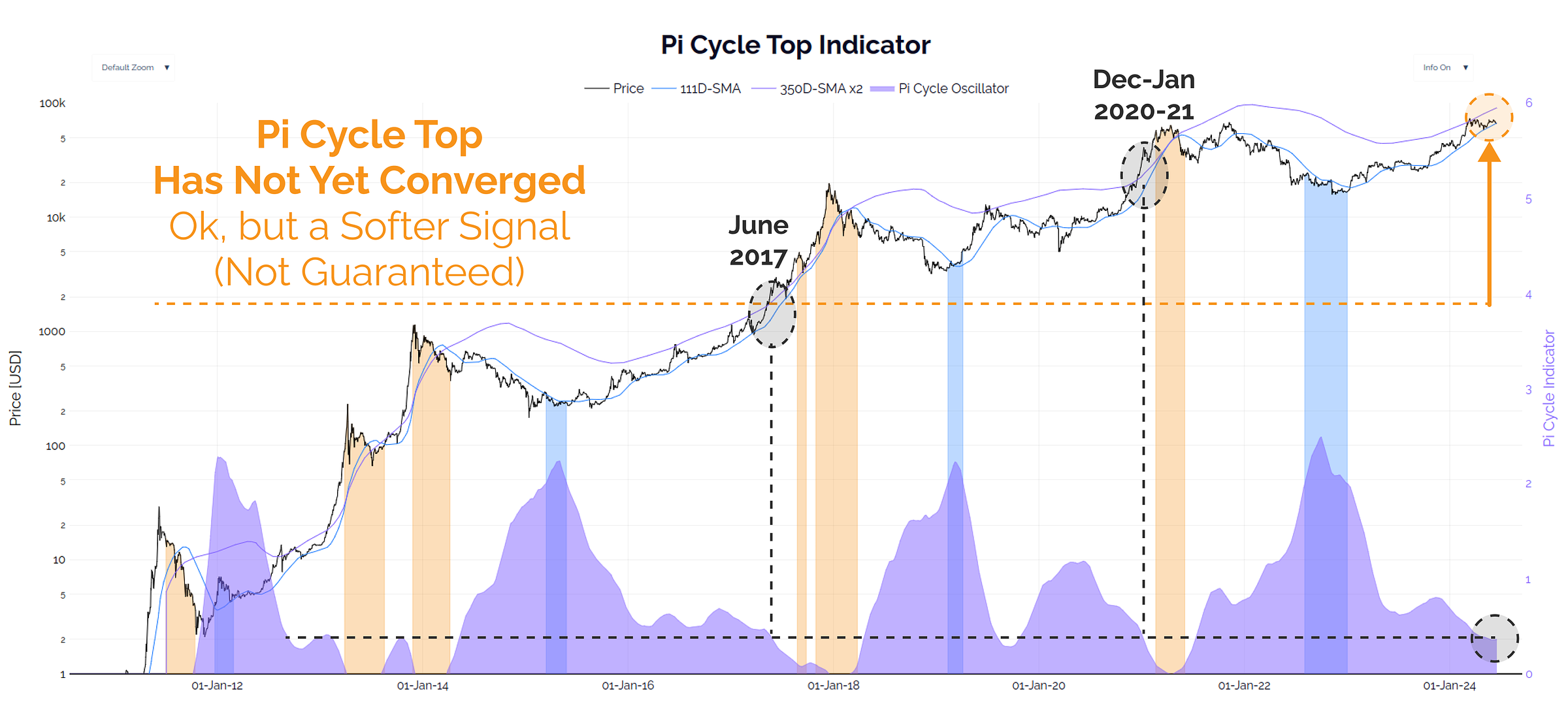
The Pi-Cycle top is a crowd favourite, as it helps folks spot cycle tops when the two moving averages converge and/or cross-over. Whilst I personally don’t assign the highest weight to this metric, I know many others do.
Where it stands today, the distance between the Pi Cycle Top averages is very similar to previous ATH breaks. There are two interpretations of this:
- The market has plenty of room to run if history rhymes = Optimistic.
- There is no guarantee they need to cross at all = Assess via other metrics.
 Live Chart
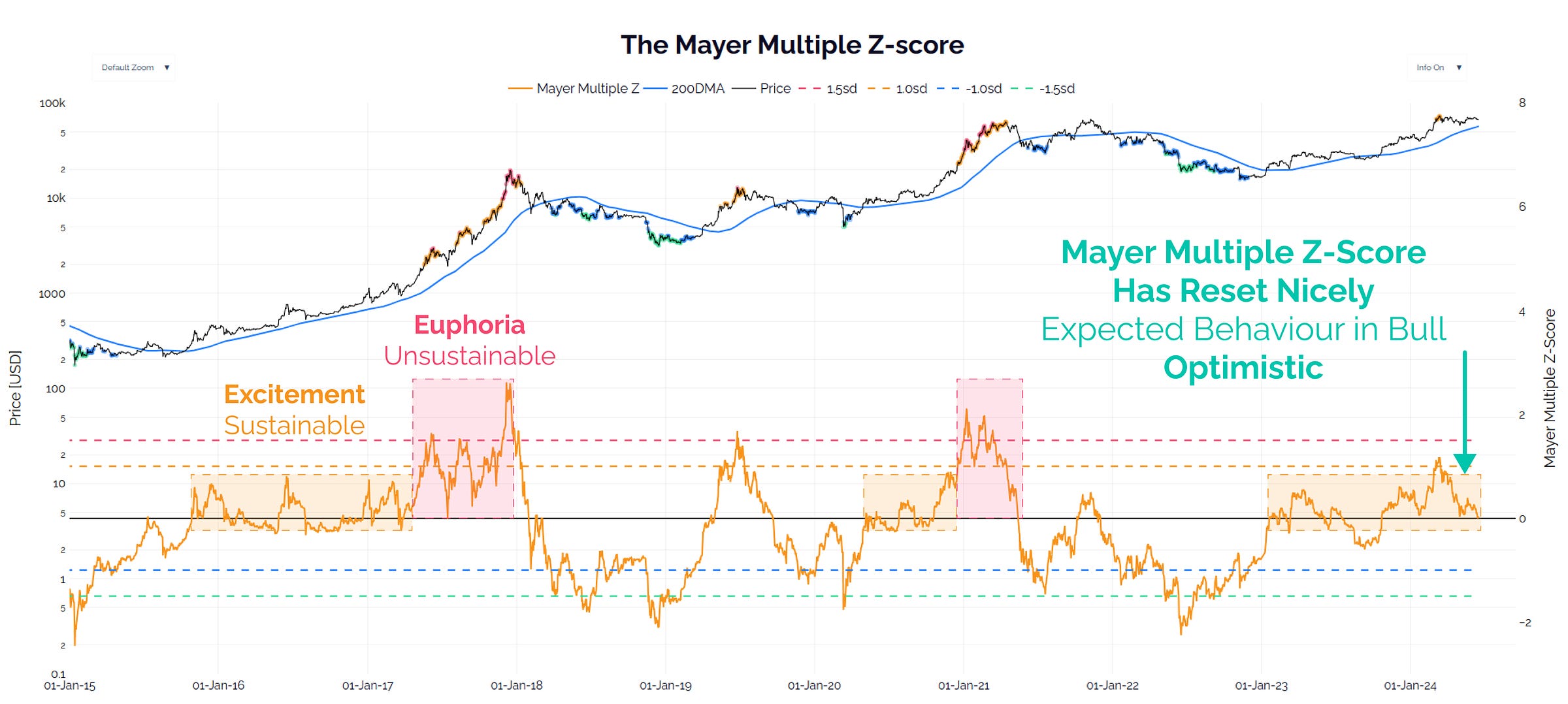
The Mayer Multiple is the Bitcoin world’s name for the ratio between price and the 200-day moving average. This is a metric I do assign weight to, since every trader and his dog uses the 200DMA. In this instance, I am using the Z-score of this metric to assess statistical deviations.
The Mayer Multiple Z has reset to neutral, which indicates there is basically no froth in the market. This is also expected behaviour for a bull market, which has me feeling generally Optimistic about pricing models overall.
I will be watching for any deterioration in this metric, and the 200DMA is located at $56.8k should the plunge protection team be called on for support.
 Live Chart
Unrealised Profit and Loss
Assessing the ‘paper gains’ of investors is a decent proxy for when they are likely to ramp up their sell-side activity. We also know that Long-Term Holders distributed into the $73k ETF peak in March, but have backed off since then.
The AVIV Ratio is, in my opinion, a superior iteration of the MVRV Ratio, as it reflects the average cost basis of active investors (not per unit of BTC). This filters out Satoshi, early miners, and lost coins for example.
The AVIV Ratio Z is well into a cool down period since the March ATH. It resembles either an ‘Echo Rally’, or an ‘Early Bull’ market. I remain Optimistic that the latter is more likely, but the former is certainly a possibility.
I’d also float the idea that an ‘Echo Rally’ like 2019 doesn’t need to descend into a nasty bear, nor March 2020 style flash crash. It might look like…boring old Chopsolidation for a period of weeks to months…feels familiar.
 Live Chart
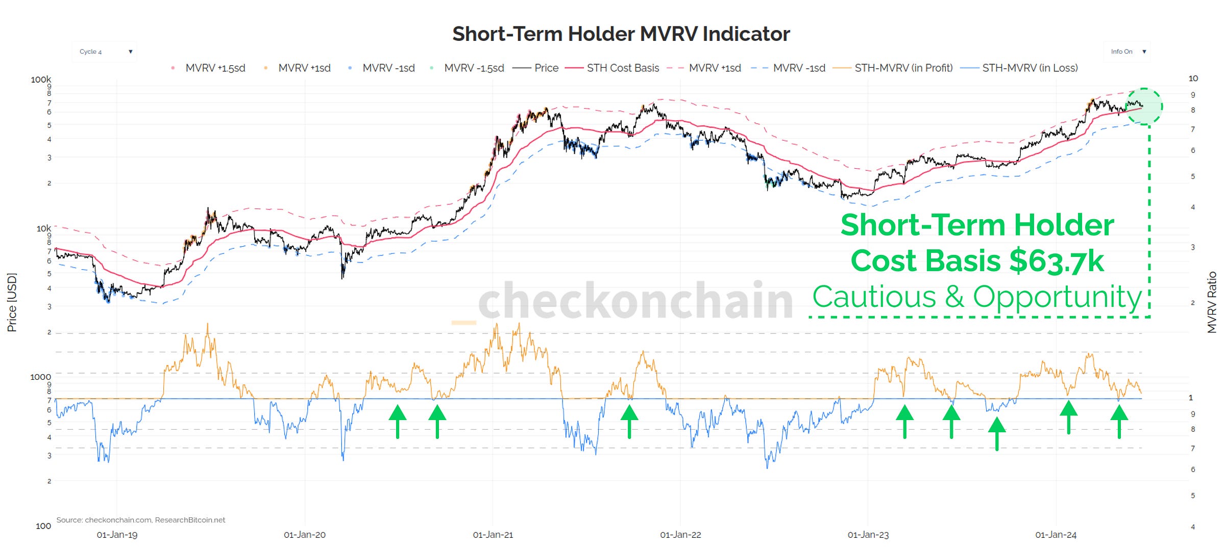
For the Short-Term Holder cohort, we are seeing the spot price ($65.5k) edging ever closer to this cohort’s cost basis ($63.7k). This is a key level where we could expect investor behaviour patterns to shift meaningfully. Keeping with our theme of holding two competing ideas at the same time, a retest of the STH Cost Basis could be:
- The point at which the bull succumbs to the bear, and we must fasten our seatbelts for a longer and rockier road.
- The point at which the bulls should mount an appreciable defence, and an area where I personally would see as a near-term value zone.
As with many metrics above, if it ain’t broke, don’t fix it. I remain Optimistic, but Cautious, expecting that the STH Cost Basis will provide support…unless it doesn’t.
 Live Chart
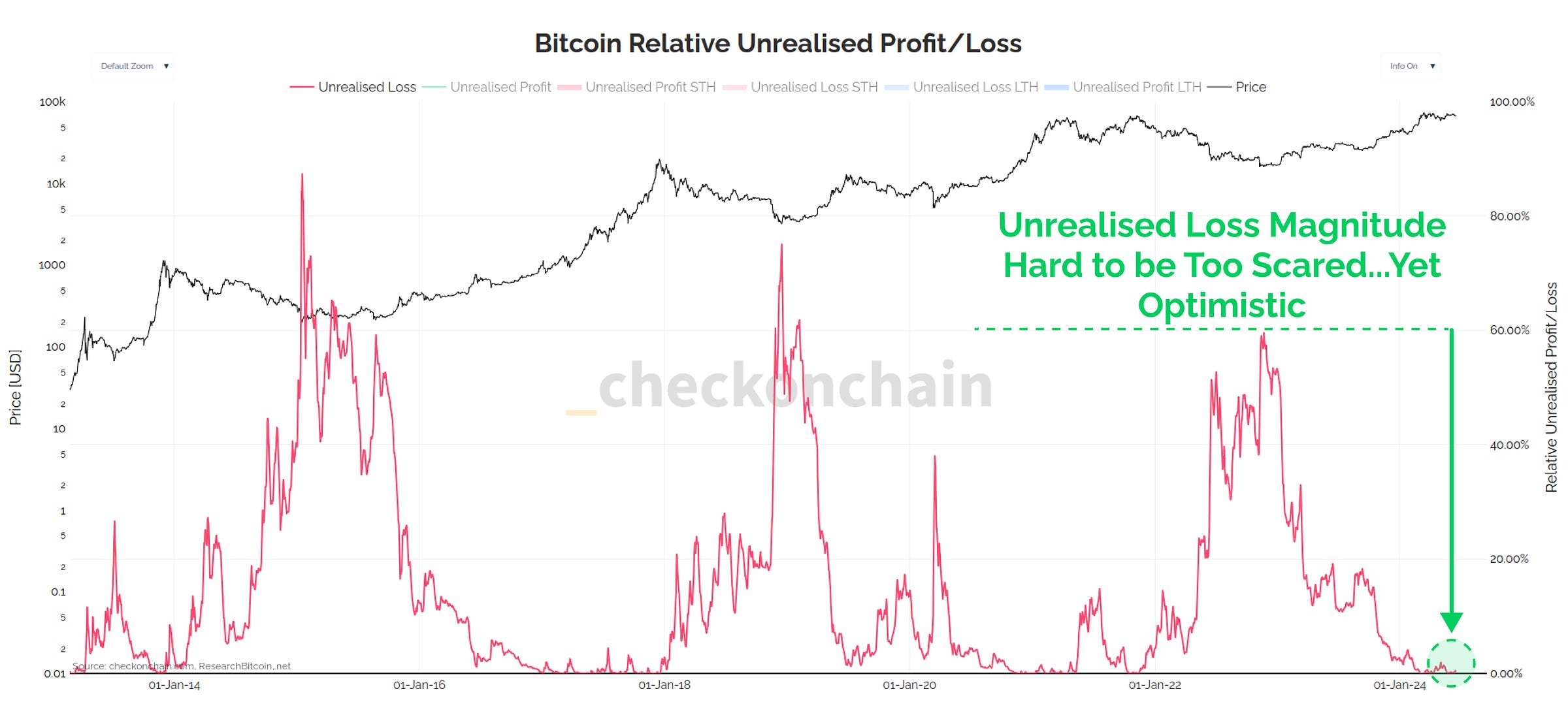
Supporting my Optimistic view above, the proportion of the Market cap held in an unrealised loss is honestly pretty small. I find it hard to get too concerned about a panic selling cascade when so little of the supply is holding any appreciable losses.
Unrealised losses in the market are yet to deviate from bull market correction norms, leaving me Optimistic until proven otherwise.
 Live Chart
Spending Behaviour
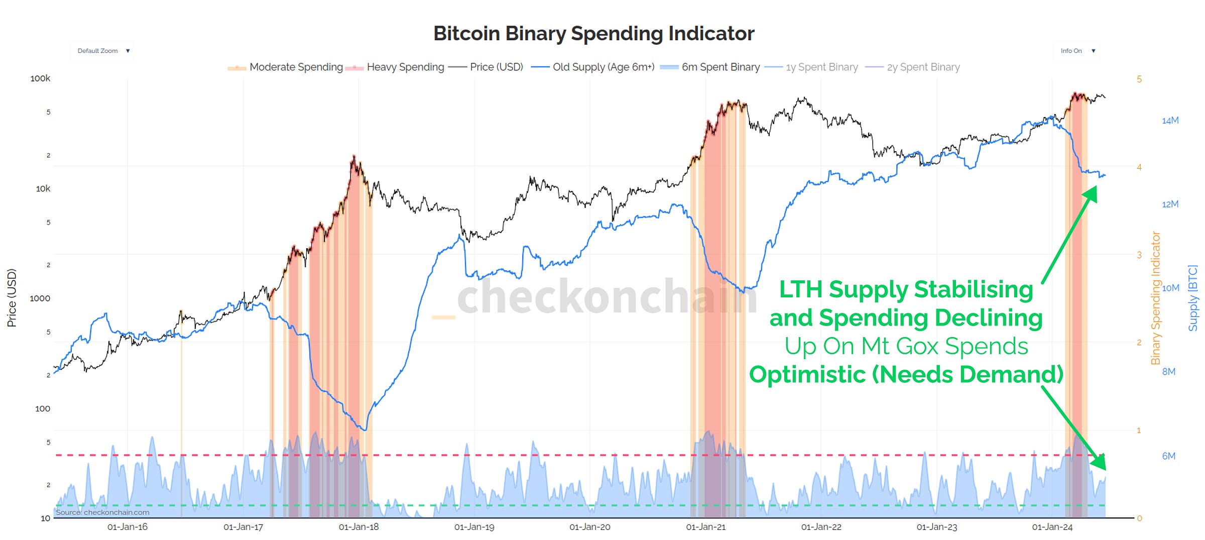
Long-term Holders have been the primary headwind for the market so far, which is very normal, and completely expected behaviour. Patient bottom buyers always take chips off the table as the market approaches new ATHs, as they wait for sufficient buy side demand, and know the excitement of ATHs is when it shows up.
Now over the last few weeks, their distribution pressure has lessened significantly, and LTH supply is stabilising. In theory, this should remove headwinds, and make the bulls job easier.
This is an Optimistic scenario, however it has an important caveat: Demand has to show up. Just because LTHs are selling less, doesn’t mean the market can automatically head higher without an increase in marginal demand.
 Live Chart
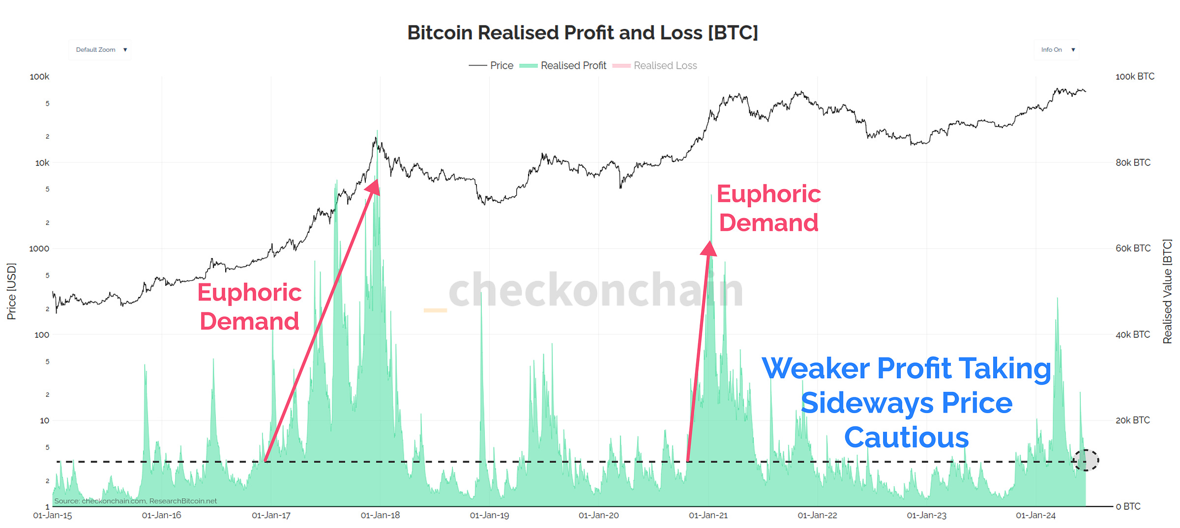
We can see a similar story when looking at Realised Profit volumes locked in by holders. This metric has pulled back significantly since the March ATH, but the market has traded sideways to lower since then.
Thus, I find myself a little Cautious that we’re simply not seeing a serious uptick in marginal demand for Bitcoin. This isn’t strictly a bear case, but it also isn’t a bull case.
Keep in mind, that lower prices can also stimulate demand, as the HODLers Dollar goes a little bit further.
 Live Chart
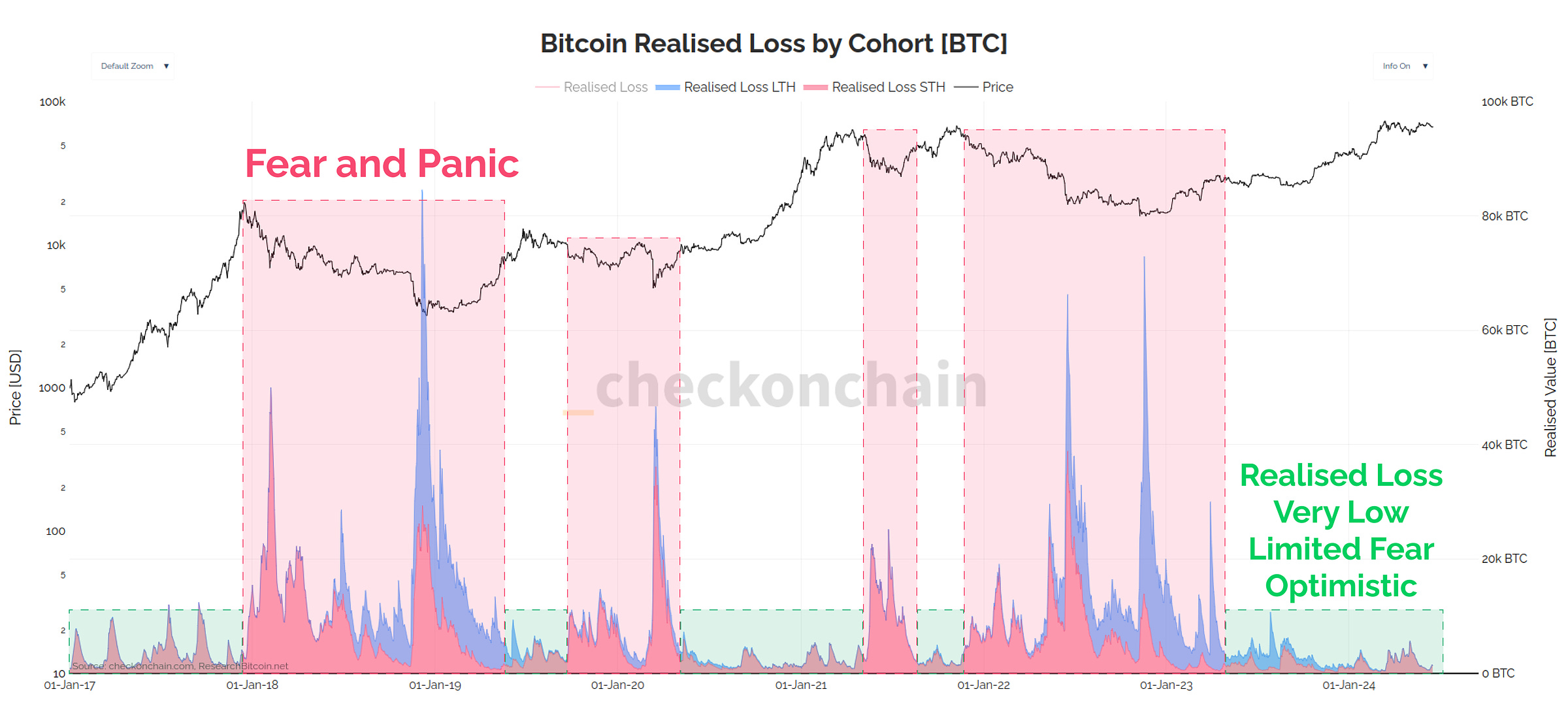
Similar to Unrealised Losses, we are not seeing any significant uptick in panic selling and loss taking. It continues to look like a typical bull market correction, where local top buyers take the L, but the majority just sit tight, and wait.
Until I see a meaningful uptick in realised losses, I prefer to stick to my Optimistic view that everything remains within the realm of expected behaviour.
 Live Chart
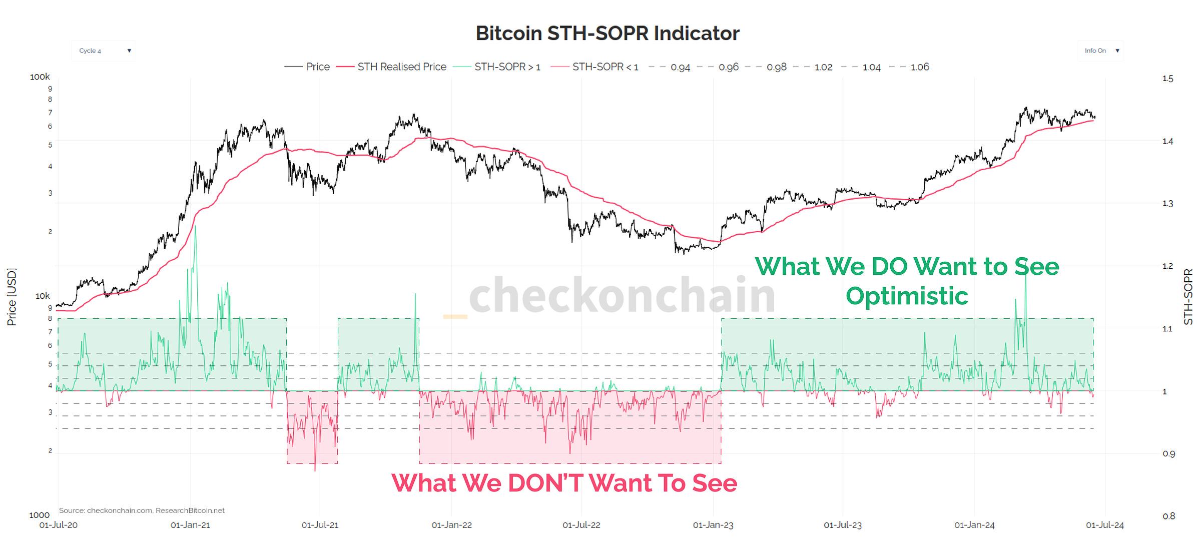
And our final metric is the trusty STH-SOPR, which is back to retesting the neutral level of 1.0. Since this metric describes recent buyers, this indicates that local top buyers are now starting to sell lower.
Brief slices below 1.0 is expected behaviour, and is a key input into my own personal DCA strategy (thus Optimistic). I will be keeping an eye on whether it deteriorates into a sustained period of loss, especially if it accompanies the price break below the STH Cost Basis ($63.7k).
Note: If you’re relatively new to the checkonchain newsletter, I would encourage you to check out our prior piece titles How I’m Thinking About this Dip, which covers the type of behaviour we expect during a bull market dip.
 Live Chart
Concluding Thoughts
There is a lot of data out there folks, and distilling it into a cohesive, and easy to understand story can be a challenge. That said, I personally love giving it a crack each week, and occasionally rolling out a new tool which simplifies it further.
Whilst the wacky looking thing below is iteration #1, I think it can help us isolate which innings we are in across a broad range of metrics that describe the Bitcoin economy. I have overlaid (in red) the values seen during the cycle tops of 2017, 2019, April 2021, and March 2024, which we can use to compare to the current conditions.
 Live Chart
If I bring it all together, the Bitcoin market is almost exactly where I would expect it to be whilst consolidating around the prior cycles ATH. It is a little bit softer around the edges, with limited onchain activity, and a few metrics approaching key decision points. Nothing is outside the ordinary just yet, and I’m not seeing many signs of investor panic or concern.
I know you’re sick of hearing it…but gun to my head, Bitcoin looks it is still within a period of Chop-solidation, amidst the backdrop of a macro bull market. I like using 2019 as a mental model, as the conditions feel very similar to me.
That said, the rest of the world is in a weird spot. Economic data is softening, Nvidia is the only stock that goes up, and the US election cycle is as batshit crazy as it has ever been. I won’t pretend to know how any of this plays out.
Something I have found extremely useful at times like this is to train myself into holding two competing opinions at the same time in markets.
Often, it is all a matter of perspective.
Thanks for reading,
James