Understanding Different Types of Charts
In this resource, we’ll discuss the 2 main types of graphs you will find when analysing cryptocurrencies—candlestick and line graphs.
Candlestick Charts
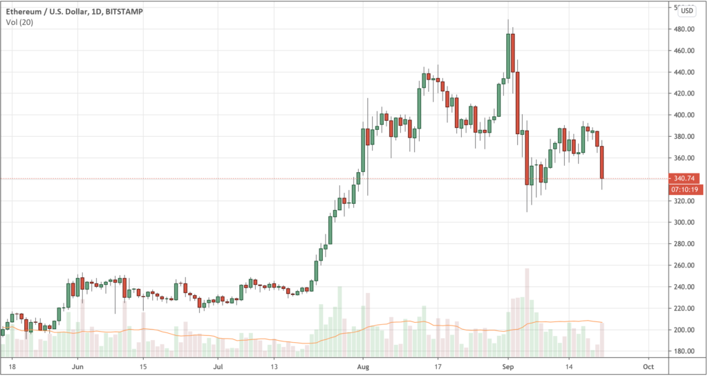
Candlestick charts are one of the most common charts used by investors and traders as they graphically depict price movement within a single timeframe. Each candlestick on the chart represents a specific period (often minutes, hours, days, weeks or months). Each candlestick can tell you the opening price, highest price, lowest price, and closing price within the specified timeframe—also known as an OHLC chart.
- Open: the price of a cryptocurrency when the trading period begins.
- Close: the price of a cryptocurrency when the trading period ends.
- High: the highest price of a cryptocurrency over a given trading period.
- Low: the lowest price of a cryptocurrency over a given period.
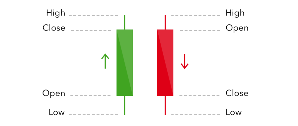
In candlestick charts, the ‘open’ and ‘close’ prices within a specified timeframe are represented by a box, referred to as the body. The ‘high’ and ‘low’ prices are represented by a line both above and below the ends of a body, referred to as the wicks.

Green candlesticks represent a period of time where the price has increased. We can see this because the ‘open’ price is lower than the ‘close’ price.
For example, let’s say the green candlestick (see Fig.1.1) is representative of 1 day and let’s say the price opened at $10 (bottom of the candlesticks body), however, throughout the day the price got as low as $9.80 (bottom of the line below the body) and as high as $11.20 (top of the line above the body) before closing at $11 (top of the body).
Conversely, red candlesticks represent a period of time where the price has decreased, and again we can see this because the ‘open’ price is higher than the ‘close’ price.
For example, let’s say the red candlestick (see Fig.1.1) is still representative of 1 day, except this time the price opened at $11 (top of the body), however, throughout the day the price got as high as $11.20 (top of the line above the body) and as low as $9.80 (bottom of the line below the body) before closing at $10 (bottom of the body).

Line Charts
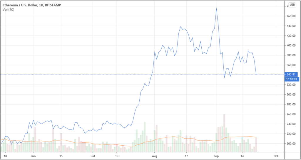
Line charts are commonly used in cryptocurrency. They display the historical price points of an asset. Line charts are helpful as they help visually represent an asset’s price using a single continuous line, making it easier to read. This is compared to candlestick charts, which have more data points.

By using line charts, it is easier to identify key support and resistance levels, trends and recognisable chart patterns. They depict changes in an assets closing price over time—making them useful for tracking averages and long-term movements.
You can use a line chart to simply track one price movement or stack multiple line charts on one graph to compare different data, such as in the example above.